Saturday, April 28, 2012


My husband recently returned from training on the East Coast and while I was waiting for him at the Airport, I thought of this assignment.  Airports can be intimidating places with a large volume of travelers constantly passing through.  Airports are filled with people from all over the world making the need for clear information design even more crucial.  There are often people in a hurry who need clear information to assure they get to where they need to be in a limited amount of time.  Aside from being able to get to your correct gate, there are many other points of interest at Airports.  Places to eat, connect to the internet, purchase souvenirs (just to name a few).  Universal signs are a very important tool to assist travelers with making everything go as smoothly as possible.  Clear signage begins before you even get inside the Airport.  Traffic can get a little crazy and San Diego Airport does an excellent job with guiding travelers to appropriate drop offs and parking  Inside the Airport there are very large and colorful signs indicating where each airlines check in gate is.  I do not think that the security line is well labeled though.  For example, travelers must remove their laptop from its case and have it scanned separately.  There is no sign to indicate this in advance, so there are often hold ups do to someone having to go back in line and separate their laptop from the case.  Once through security, I think that the Airport is very well labeled.  There are clear signs directing people to what they are looking for.    The most effective tool is the large electronic board that lists in alphabetical order all of the arriving and departing flights.  There are large signs above each terminal to assist travelers as well.  I haven’t traveled very much but have found all of the Airports that I have been to have been very well designed from an information design standpoint.  The incorporation of universal signs, large and colorful signs and guide maps are all effective tools.
Below are examples.  To reduce confusion and potential for accidents, signs are placed on the drop off cirlce to guide travelers to their intended drop off.


Inside the airpport most of the restaurants have large and colorful signs to attract attention.  I noticed that they also had a copy of their menu displayed outside of the restaurant.  With people in a hurry, this helps customers make decisions prior to getting inside the restaurant, assuming there is a wait.  Thus shaving time off for them.

Friday, April 27, 2012


“To really understand a data set, you need to process it yourself.  Seventy-five percent of our time is spent reporting, gathering and distilling information” – Archise Tse

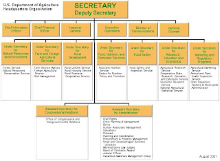
Based on the kind of information that you are trying to relay to your audience, various charts/maps can be used.  By using flowcharts, time needed to absorb the concept is reduced.  Flowcharts are a way to condense information into an easy to follow design. Central ideas are placed in the middle while supporting ideas surround it.  The use of color, different shapes and patterns can enhance your chart.  Charts can show hierarchy and would be helpful in a business  or a family tree for example.  Example below:


Another example of a useful chart shows a central topic with supporting ideas around it.  Subtle details like the center item using a circle and the outter items using squares are great ways to show a difference.  The reader instantly notices that the idea with a circle is a central point. 


The possibilities are endless when creating your own chart.  You can keep it as simple as you feel or incorporate as much color, shape and connectors are you see fit.  The use of concept maps reduces the amount of space you need to relay your message.  It is also beneficial to the audience as they save time with viewing an easy to follow chart rather than reading a lengthy explanation. 

Thursday, April 26, 2012


There are so many tools available to assist with web design.  Several steps are important in deciding which tool(s) should be used.  Depending on target audience, desired result and designer (to name a few), tools that would be beneficial can be decided upon.  One tool in particular that jumped out at me is Type Styling.  “The styling of type is another key way to differentiate types of information and establish a sense of hierarchy”  (94).  I feel that the use of Type Styling is subtle, yet effective.  With a variety of tools available to the user, this is an example of one where less is more.  Type Styling is particularly effective in designs created for a vast group due to its simplistic nature.  Key points can be made and emphasized through the use of color, font style, size and placement.  Examples of Type Styling can be found in invitations, news articles, even in our readings for this class!  Below are some examples:


A safety flyer at work, an informational newsletter for clients and a link to a news website.  Type casting assists the reader with processing information and draws focus to


http://www.cnn.com/


Works Cited

Baer, Kim. Information Design Workbook, Graphic Approaches, Solutions, And Inspiration +30 Case Studies. 


Monday, April 9, 2012

Social Media


Everyone absorbs and retains information differently.  I believe that knowing your audience is a critical part to helping that audience absorb and retain.  With technology constantly advancing, Social Media has exploded into an important part of everyday life for many people.  Social Media comes in forms like Twitter, Facebook, Blog, etc.  These design tools have changed the way in which participants (the audience) receives their information.  Facebook for example has transformed from a way to keep in touch or reconnect with old friends to a constant barrage of ideas, information, opinions and causes.  A clever way that many are able to spread their message, while keeping their audience engaged, is through the use of pictures with short narratives.  I also believe that these messages are passed to larger audiences because people want to be seen “liking” and "sharing" a message, especially one that is heart wrenching.  Below is an example of one of these visual messages. 


Everything from inspirational messages to political messages to fundraising events can reach mass audiences in a short amount of time through a web of connections.  Social Media sights, like Facebook, focus on a fast paced and wanting to be a part of something special group of people.  Knowing the audience in these social media outlets plays a huge part in the layout of these programs. 


Sunday, March 25, 2012


The process of Information Design involves several steps to help create an effective final product.  Due to the nature of the project, these steps can vary and some may be more important to focus on.  Steps that are greatly important to the implementation of an effective project are:

1.      Knowing the needs of your client

2.      Understanding the target audience

3.      Forming a work group with clear assigned roles

4.      Making a creative brief to keep client and team members on the same page

5.      Create a prototype to test the final product.  This will include developing a general test audience as well.

I believe that the most important step in an information design product is to understand the target audience.  In the beginning of the panning process the most important thing to understand is who your audience is.  Understanding who they are and how they interpret and absorb information will provide the designer with the initial ideas for the project.  There are many contributing factors that will affect the amount of color, shapes, simplicity or more complex layouts, based on the audience.

Another important step in the creative process is how you, the designer envisions the final product.  While it is important to work toward meeting the goals and needs of the client and audience, it is also important to fulfill one’s own expectations of the project.  Each designer has different strengths that they will need to learn how to incorporate into varying clients and audiences. 

Combining the client expectations, audiences desired result and individual strengths will create a final product that everyone is happy with.

Sunday, February 26, 2012


As the name indicates, Human-Centered Design, focus’ on human involvement and advancement.  Through using innovation and diversity, the goal is to not accept but to push further ahead.  There are eight components which play into this:
 
1.       Absorb new knowledge and transform it

2.       Draw conclusions about the unknown from the known

3.       Take initiatives

4.      Make decisions

5.      Work with a team

6.      Adopt a systematic, analytical approach

7.      Plan independently

8.      Take on responsibility
Human-Centered Design keeps the human involved and encourages thinking outside of the box.  It calls on one to participate and go above and beyond and strive for more.  As stated by Jacobson, “We are gradually becoming observers of life rather than its active participants” (p. 80).  Looking at things “from a new angle” is one context of Human-Centered Design.  Complacency is a weakness and ultimately leads to a lack of drive and production.  This theory asks people to seek out answers rather than just continue with the one solution that may have already been established.  With a growing and culturally diverse society, one answer for everything cannot be the only option.

As with everything, there is a negative side to Human-Centered Design.  This theory is based on a desire to achieve more.  Most people become content with the way things are.  Society has shifted and many just go with the flow.  This theory is only as successful as those who attempt to practice it.  Therefore this theory will not work for everyone. 

Human-Centered Design is appealing to me because it is exciting and encouraging to stimulate and promote many ideas and create connections between varying groups and people.

Friday, February 24, 2012


Information Design is a continually growing discipline which combines several factors to ensure its effectiveness.   Being a constantly changing and broadening concept, there are many varying definitions for information design.  Information Designers themselves do not always agree on a definition.  At first, not having a 100% definition of this topic was very intimidating to me.  Now I understand that information design is around all of us and part of our daily lives.  It is a tool used by many to effectively communicate and receive messages across a broad, large group of individuals.  Breaking down the words Information and Design helps to understand its purpose.  Information is the understanding on data received by us all of the time.  Design is the arrangement of this information.  Because information design contains many disciplines, one can focus their information design projects based on their preferences and strengths. For me, graphics are what grab my attention, so that is what I will concentrate on.  Considering factors like message and audience are also variables to affect the outcome of your information design project.

There are many examples of information design at work in our lives.  Traffic signs, posters and signs around the office and comics are just some of the many examples.