“To really understand a data set, you need to process it
yourself. Seventy-five percent of our
time is spent reporting, gathering and distilling information” – Archise Tse
Based on the kind of information that you are trying to
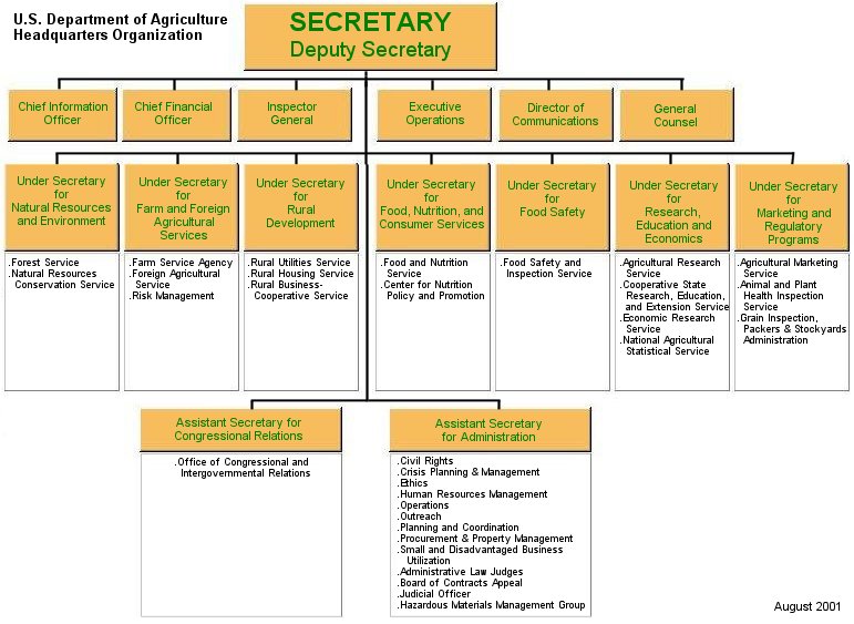
relay to your audience, various charts/maps can be used. By using flowcharts, time needed to absorb the concept is reduced. Flowcharts are a way to condense information into an easy to follow design. Central ideas are placed in the middle while supporting ideas surround it. The use of color, different shapes and patterns can enhance your chart. Charts can show hierarchy and would be helpful in a business or a family tree for example. Example below:
Another example of a useful chart shows a central topic with supporting ideas around it. Subtle details like the center item using a circle and the outter items using squares are great ways to show a difference. The reader instantly notices that the idea with a circle is a central point.

The possibilities are endless when creating your own chart. You can keep it as simple as you feel or incorporate as much color, shape and connectors are you see fit. The use of concept maps reduces the amount of space you need to relay your message. It is also beneficial to the audience as they save time with viewing an easy to follow chart rather than reading a lengthy explanation.
No comments:
Post a Comment